-
Notifications
You must be signed in to change notification settings - Fork 3
Data legibility and interface challenges
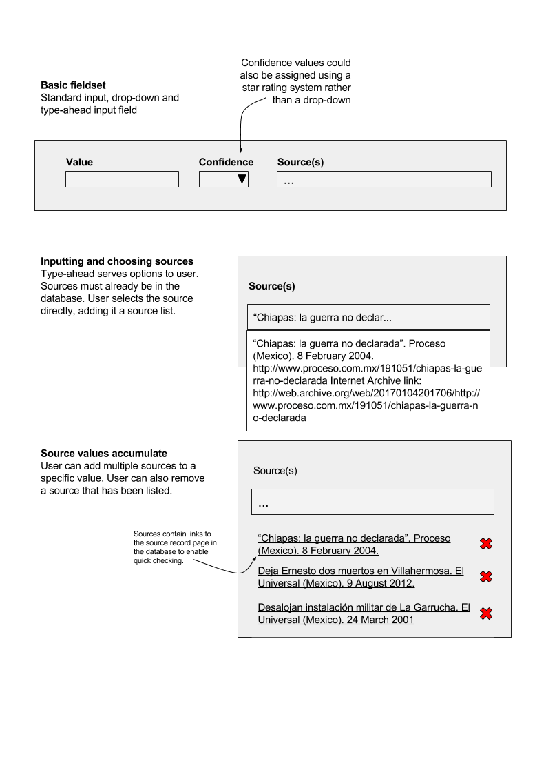
When editing a record that is already in the database, the user will probably have reasons have to manage multiple sources and their relations to any specific value. Below is a concept for how it might be done in a user-friendly way, applicable to any field where sources need to be added. It does not include an option to add a source on-the-fly - sources should be already in the database.
During data entry, organizational and event records include geographical data and we need a better way to add it.
The geographical data isn’t arbitrary, but based on nodes and relations picked from OSM. A method for applying this data alongside the source and timescope could be a widget enables the user to different OSM nodes or relations (individually or in bulk). The user would see the data added to a map as they progress, giving clear visual feedback and helping to reduce errors. OSM contains many Nodes and Relations that have the same name so the user will need to be able to check their work with visual or other aids.
There’s a lot to consider in the usability here to make it un-clunky (and probably mobile would be a nightmare!) The user would need to specify the type of geographical information: area of operations, Headquarters or site. In our experience, it is common that a number of OSM references need to be added at once (for example Mexico AL6 shapes). However, they share the same sources and timescope. If the OSM reference field took comma separated input, it would eliminate the need to loop through each reference number by hand, one by one.The user would need to have already found the OSM node or relation numbers that they wanted to add. The OSM API would be used to populate the Name data and additional information that could improve a geographical search of the SFM data. The user can also select an existing shape or point on the map to display the data that has already been added, and have the option to remove the shape or point from the map.
It’s very hard to top a table.
Because they are straightforward time series data, there are a numerous easy ways that organizational command (and person career) histories can be shown and used as a way to access additional records. Per the version in the CMS now for 19 Zona Militar, a table:
This shows the full, accumulated command history, from beginning to start. The key improvement here would be to update the default sort to be on Start Date, in descending order. The organization’s most recent commander should either be highlighted or pulled out into a more prominent content area.
In terms of visualisation the same data could also be shown as a parallel series timeline (which is also useful for finding errors; note the overlap in command - error or actual overlap?):
This gives a far clearer view of the time period covered, and the progression in command. The gaps in command are also prominent; the table, for example, makes it more difficult to see that aspect. A stacked timeline achieves a similar effect; it’s is a little more compact, though the labelling could get freaky and may make it less useful:
There are various ways that such views might change depending on how the user accessed the content. For example, if the user entered the 19 Zona Militar records from a search like “Commander of 19 Zona Militar June 2008 how would these visuals show that the user’s question had been answered? There are probably two ways. First, show the full record, and highlight the relevant part of it, for example:
Or, show the information available until the end of June 2008, the cut off point for search:
Both leave the user with some work to do to find the answer.
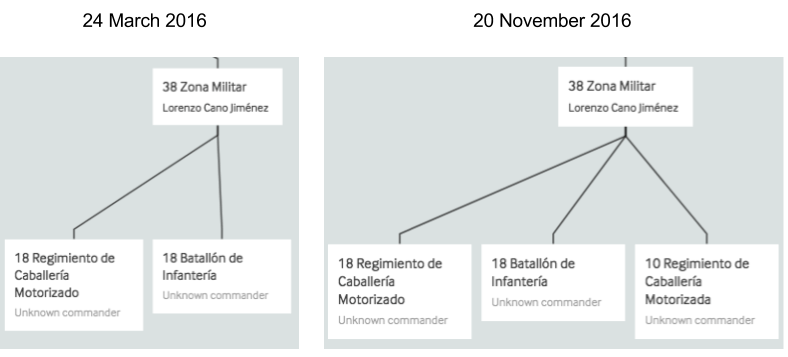
However, the changes in other types of data are a little more tricky to show in a single visual. For example, here’s two views of a command structure, which it is intuitive to visualise as a tree diagram, at two different points in time:
Side by side, the change is clear. However, that doesn’t grow particularly well - the user needs to take an action to have the notable change displayed - in this case the time when 10 Regimiento de Caballería Motorizado became subordinate.
A simple way might be a drop-down menu showing the relevant change points:
Time sliders could help here. Rather than a completely free time-slider (as in the prototype front-end) a timeline that shows a fixed set of options - when a notable change in the data has happened - would be more appropriate.What options are available?
Here’s the time slider from Google Earth Pro (desktop version). It controls the display of the satellite imagery. Each white tick on the line represents a date when new imagery was added for the area currently viewed by the user. The user can use the left/right arrows to move cleanly between the image update points; the imagery changes automatically. The user can also configure the start and end points of the time slider. As the user zooms out, the number of update points grows - Google Earth is a massive tapestry of imagery - but this mechanism still works:
Perhaps even more usable is the time controls on Internet Archive’s Wayback Machine, a tool specifically designed for time travel - and one that is familiar to the Monitor. There are numerous views of the different web-page snapshots that are available to browse:
Most useful perhaps is the set of controls sitting on the top of each page snapshot, which give the user an indication of how to get to the next archived page in sequence:
[[https://i1.wp.com/securityforcemonitor.files.wordpress.com/2017/07/datamade_sfm_-scope_and_roadmap_document_for_the_product-_google_docs.png]]
Another titan of the Internet - the BBC weather site - has a nice simple approach to showing change over time - here the weather map over London. The passage of cloud cover is controlled by clicking the arrows, which move the map forward or backwards in time in 4 hours notches.
When applied to our structure chart, these ideas begin to look quite interesting:


