-
-
Notifications
You must be signed in to change notification settings - Fork 1
/
Copy pathday26_choropleth.py
189 lines (169 loc) · 6.76 KB
/
day26_choropleth.py
1
2
3
4
5
6
7
8
9
10
11
12
13
14
15
16
17
18
19
20
21
22
23
24
25
26
27
28
29
30
31
32
33
34
35
36
37
38
39
40
41
42
43
44
45
46
47
48
49
50
51
52
53
54
55
56
57
58
59
60
61
62
63
64
65
66
67
68
69
70
71
72
73
74
75
76
77
78
79
80
81
82
83
84
85
86
87
88
89
90
91
92
93
94
95
96
97
98
99
100
101
102
103
104
105
106
107
108
109
110
111
112
113
114
115
116
117
118
119
120
121
122
123
124
125
126
127
128
129
130
131
132
133
134
135
136
137
138
139
140
141
142
143
144
145
146
147
148
149
150
151
152
153
154
155
156
157
158
159
160
161
162
163
164
165
166
167
168
169
170
171
172
173
174
175
176
177
178
179
180
181
182
183
184
185
186
187
188
189
# -*- coding: utf-8 -*-
# ---
# jupyter:
# jupytext:
# formats: ipynb,py:hydrogen
# text_representation:
# extension: .py
# format_name: hydrogen
# format_version: '1.3'
# jupytext_version: 1.9.1
# kernelspec:
# display_name: Python 3 (ipykernel)
# language: python
# name: python3
# ---
# %% [markdown]
# # Day 26 : Choropleth map
#
# A choropleth map is a type of thematic map in which
# a set of pre-defined areas is colored or patterned
# in proportion to a statistical variable that
# represents an aggregate summary of a geographic
# characteristic within each area, such as population
# density or per-capita income. (Source:
# [Wikipedia](https://en.wikipedia.org/wiki/Choropleth_map))
# %%
import zipfile
import geopandas as gpd
import numpy as np
import pandas as pd
import pygmt
# %% [markdown]
# ## Get NZ COVID-19 vaccine uptake data
#
# Uptake is the number of people vaccinated per 1000 people,
# i.e. 800 means 800/1000=80% vaccinated. When uptake is >95%,
# it is reported as '>950', which is a string value that we'll
# need to convert to a number for easier handling later.
#
# CSV data obtained from Ministry of Health GitHub page at
# https://github.com/minhealthnz/nz-covid-data/tree/main/vaccine-data
#
# Specifically, we'll use the SA2 data up to the 24 Nov 2021 release.
#
# - https://github.com/minhealthnz/nz-covid-data/tree/b7c46bb5dd150f3946c6d5c309ce1f2eb0305cce/vaccine-data/2021-11-24
# %%
df = pd.read_csv(
filepath_or_buffer="https://github.com/minhealthnz/nz-covid-data/raw/b7c46bb5dd150f3946c6d5c309ce1f2eb0305cce/vaccine-data/2021-11-24/sa2.csv",
skipinitialspace=True,
)
# %%
# Calculate 1st and 2nd dose uptake percentage
df["first_dose_uptake_percentage"] = (
df["FIRST DOSE UPTAKE "].str.replace(pat=">950", repl="950").astype(int) / 10
)
df["second_dose_uptake_percentage"] = (
df["SECOND DOSE UPTAKE "].str.replace(pat=">950", repl="950").astype(int) / 10
)
# %%
# Set SA2 id column as index
df = df.set_index(keys="SA2 CODE 2018") # , verify_integrity=True
# df[df['SA2 CODE 2018'].isin(values=['170900', '236600'])] # TODO handle duplicates
# %% [markdown]
# ## Get Stats NZ 2018 Statistical Area 2 (SA2) boundaries
#
# The Statsical Area 2 (SA2) geography aims to reflect
# communities that interact together socially and economically.
#
# 
#
# Specifically, we'll obtain the 2018 shapefile from
# https://datafinder.stats.govt.nz/layer/92212-statistical-area-2-2018-generalised/data/
# Note that the SA2 standard was set in 2018 (and the boundary polygon IDs
# still refer to 2018), and I'm not sure if using 2018 data in 2021 is
# technically correct, but this is what we'll have to do to join the data.
#
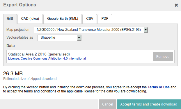
# Note that the SA2 boundaries need to be manually downloaded from Stats NZ
# (login required). Choose the default EPSG:2193 projection and 'Shapefile'
# as the vector type.
#
# 
#
# References:
# - https://www.stats.govt.nz/consultations/review-of-2018-statistical-geographies
# - https://www.stats.govt.nz/methods/statistical-standard-for-geographic-areas-2018
# %%
# Unzip the files
with zipfile.ZipFile(file="statsnzstatistical-area-2-2018-generalised-SHP.zip") as z:
for zip_info in z.infolist():
z.extract(member=zip_info)
# %%
# Read SA2 shapefile, and select only rows with AREA > 0
sa2_areas: gpd.GeoDataFrame = gpd.read_file(
filename="statistical-area-2-2018-generalised.shp"
)
sa2_areas: gpd.GeoDataFrame = sa2_areas[sa2_areas.LAND_AREA_ > 0]
# %%
# Set SA2 id column as index
sa2_areas = sa2_areas.set_index(keys="SA22018_V1")
# %%
# Join two dataframes, 'SA2 CODE 2018' with 'SA22018_V1'
gdf_vaccinated: gpd.GeoDataFrame = sa2_areas.join(other=df, how="right")
gdf_vaccinated: gpd.GeoDataFrame = (
gdf_vaccinated.dropna()
) # Remove row with unknown region
gdf_vaccinated
# %% [markdown]
# ## Plot the map!
#
# There will be two map panels created using
# [pygmt.Figure.subplot](https://www.pygmt.org/v0.5.0/api/generated/pygmt.Figure.subplot.html).
# The left panel will be a Dorling Cartogram, and the
# right panel will be a Choropleth map. Both use the same
# data, but the Dorling Cartogram will scale the data points
# based on population size, mitigating one of the main problems
# of choropleth maps - over-representing large areas with little data.
#
# These two subplots will share a single title and
# [colorbar](https://www.pygmt.org/dev/api/generated/pygmt.Figure.colorbar.html) too!
#
# References:
# - https://forum.generic-mapping-tools.org/t/how-to-color-polygons-of-a-geopandas-dataframe-in-pygmt/1138/2
# - https://forum.generic-mapping-tools.org/t/coloring-ogr-gmt-polygon-files-based-on-attribute-column/1129
# %%
fig = pygmt.Figure()
# Make colour palette, from 60% to 95% at steps of 5
pygmt.makecpt(cmap="imola", series=(60, 95, 5), reverse=True)
# Sort data so low second dose data points are plotted on top
data = gdf_vaccinated[
["second_dose_uptake_percentage", "POPULATION ", "geometry"]
].sort_values(by="second_dose_uptake_percentage", ascending=False)
with pygmt.config(PS_PAGE_COLOR="black", FONT="white"):
with fig.subplot(
ncols=2,
subsize="20c",
autolabel="+jBC", # subplot label on bottom centre
title="Aotearoa COVID-19 Vaccinations up to 24/11/2021",
clearance=0,
frame=0,
):
# Plot Dorling cartogram map on left
with fig.set_panel(
panel=0, fixedlabel="By population size (Dorling cartogram)"
):
fig.plot(
x=data.geometry.representative_point().x,
y=data.geometry.representative_point().y,
size=0.01 * np.sqrt(data["POPULATION "] / np.pi),
color=data.second_dose_uptake_percentage,
cmap=True, # use colormap from makecpt
style="cc", # circles of a certain size in cm
)
# Plot choropleth map on right
with fig.set_panel(panel=1, fixedlabel="By suburb* area (Choropleth)"):
fig.plot(
data=data,
# projection="x1:2500000",
close=True, # force close polygons
cmap=True, # use colormap from makecpt
color="+z", # color based on the Z column
aspatial="Z=second_dose_uptake_percentage", # set attribute column
)
# Plot color scale on top centre
fig.colorbar(
position="JTC+jTC+w7c+o-10c/1c+e+h+ml",
frame=['x+l"2nd dose vaccine uptake"', r"y+l%"],
)
fig.savefig("day26_choropleth.png", dpi=600)
fig.show()